In life, as in soccer, there are always winners and losers. When it comes to the official host city posters for each of the 16 destinations for the 2026 World Cup, it is undoubtedly true: some posters are great, while others are not so much.
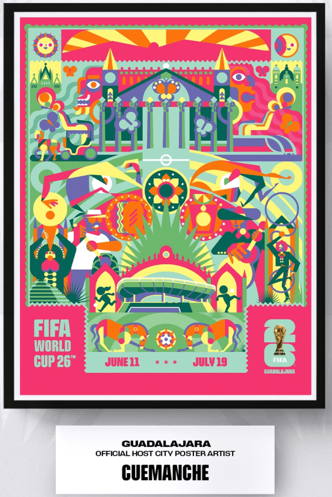
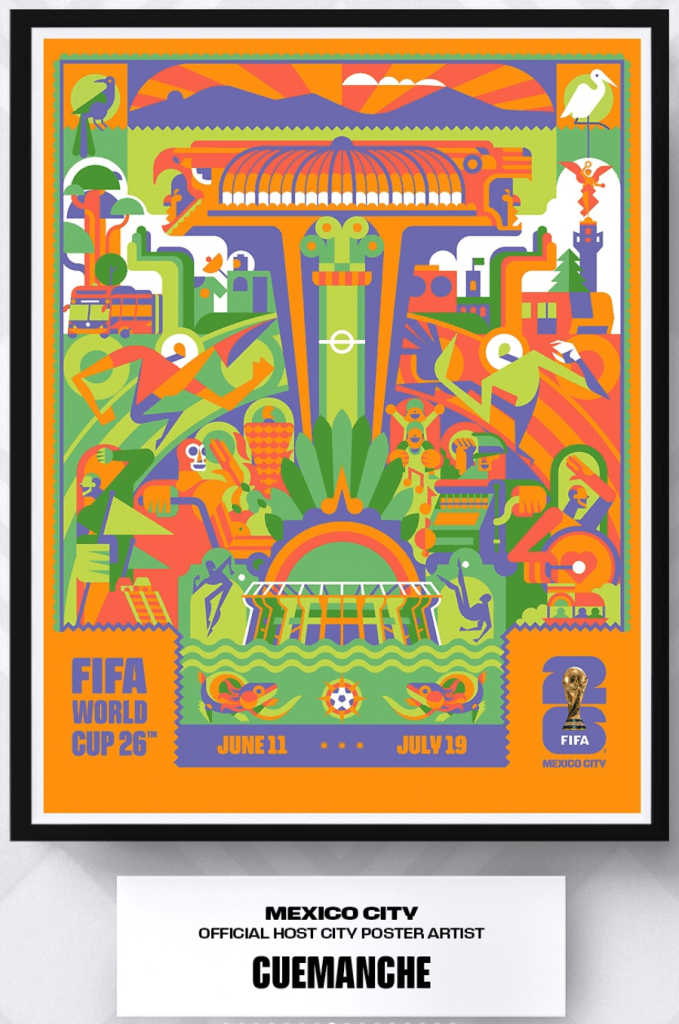
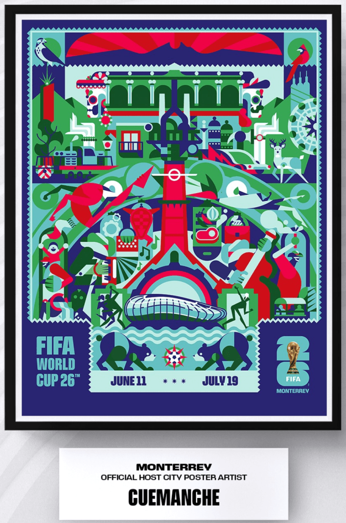
First, it is worth mentioning that for some strange reason, FIFA decided to select a unique artist for each of the Canadian and American host cities, yet the same person designed all three Mexican posters. Go figure.
The three Mexican posters are fine, but they lack distinctiveness. The Mexican Federation played it too safe. While they are nice, they do not deserve the top designation.
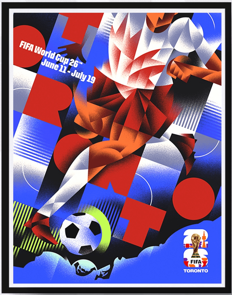
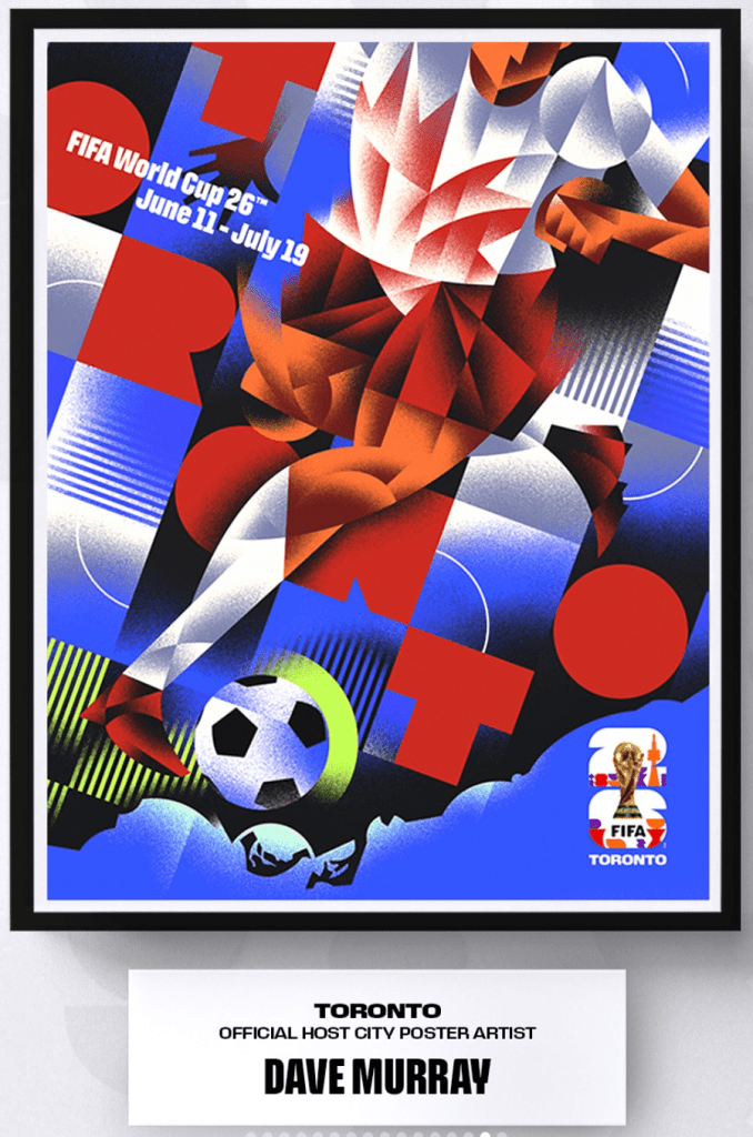
The winner is one of the two Canadians: Toronto presents a cubist image that, while abstract, is clearly discernible: A player clad in a maple leaf jersey playing the ball. The teal blue contrasts beautifully with the crimson red. Well done.
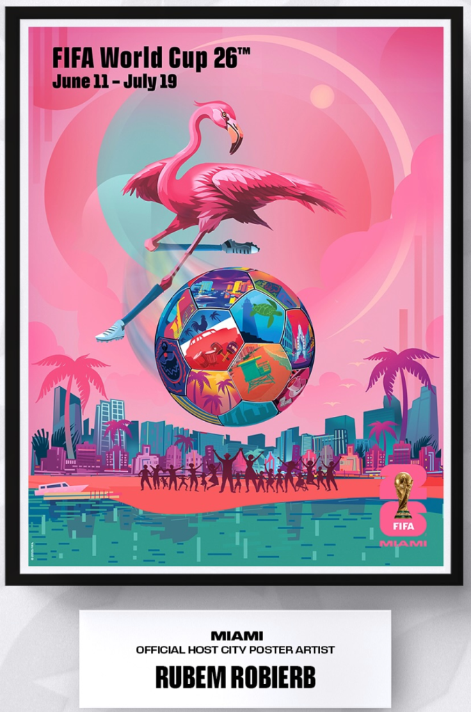
Second place goes to Miami. Although it leans a bit too heavily on pink and pastel colors, it plays with familiar tropes (a flamingo in cleats!) in a fun and effective manner. It’s not overly creative, and it captures the essence of Miami well.
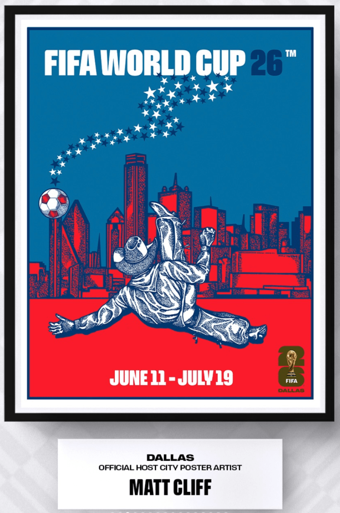
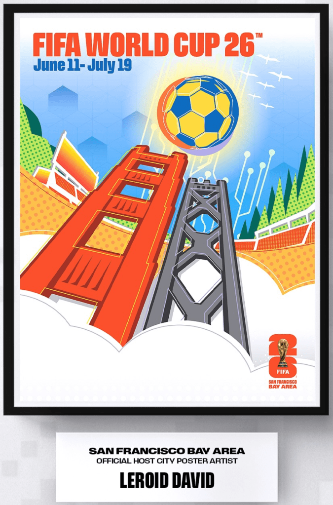
The three posters at the very bottom are also obvious, but not effective. While the Dallas poster with the rodeo cowboy doing a bicycle kick has lots of movement and wonderful color contrast (kudos for the bright red skyline), the Houstonian astronaut is not as dynamic and the color scheme looks like bad acid trip. The posters for the San Francisco Bay Area are plain lazy.
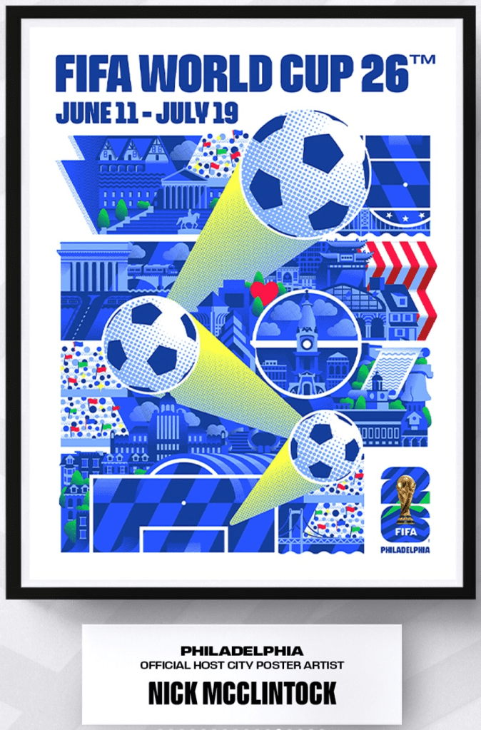
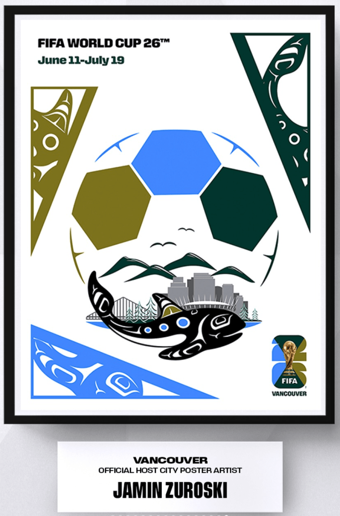
We have awarded a rating to each of the 16 posters. You can read them in the caption beneath the images:


Leave a comment